Showing posts with label pantone fashion colors fall 2011. Show all posts

Tuesday, September 27, 2011

Deep Teal - Fall 2011 Pantone Colors


Teal and Brass Necklace by nancywallisdesigns.

Deep Teal is a strong, blue-toned green. It can reveal the ocean depths and the colours of the sky at twilight. It's one of my favourites and I am forever being drawn to this colour whether it's in the form of a fabric, wall paint or jewellery upon my neck.


Wear it.

Silk Satin Dress by larimeloom.


Merino wool fingerless gloves by Neeka Knits.

Live in it.

 House & Home January 2011 issue
Go for the dramatic with deep teal walls.


Monday, September 19, 2011

Coffee Liqueur - Fall 2011 Pantone Colors


Rich and decadent Coffee Liqueur brings a sense of elegance to fall.  It's a beautiful alternative to basic black. 

Wear it.

Felted scarf by Jumi Felt.

Off the shoulder long sleeve tee by tangente.

Live in it.

Source: House and Home February 2011 issue

Sepia toned feather photo by The Gingham Owl.


Smell it.

Mocha latte soap by Tracy Gurley Bath and Body.

Friday, September 9, 2011

Quarry - Fall 2011 Pantone Colours

Jade and sterling silver bracelet 
                 by nancywallisdesigns.


A reliable medium blue grey that feels chic and modern.


Wear it.

Chunky knit cowl by Happiknits.

Burnout blues t-shirt by ellembee.

Pleated purse by EdensWake.


Live in it.

(Source: House and Home Condos 2008 issue)

Pillow by Valerie Johnson of Pillowville.

Wednesday, September 7, 2011

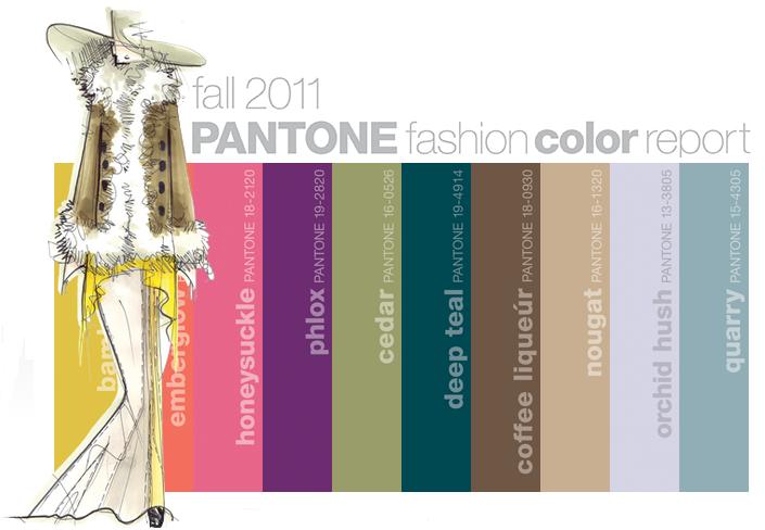
Fall 2011 Fashion Colours

Each season, Pantone surveys the designers of New York Fashion Week to identify the most directional colours.  Earlier this year they released the 10 most important colours of the season for women's fashion.
(Image: Pantone)
Taking cues from the great masters, sepia tones of old Hollywood, Chinese opera, cityscapes and countryside, designers are paying close attention to texture, contrast and color for fall 2011 – pairing menswear with feminine twists, warm prints with cool metals, incorporating both old and new influences, and creating an intriguing balance between colors. (Pantone)
“Designers take a painterly approach to Fall 2011 by artfully combining bright colors with staple neutrals, reminiscent of how an artist would construct a stunning work of art,” Leatrice Eiseman, executive director of the Pantone Color Institute. 

A lovely mix of neutrals with bright pops of colours. This is a colour palette that I liked right away.  I can easily visualize wearing these colours (except for maybe bamboo which I think I would have a hard time pulling off). As well, I can see these colours extending right into my home.  Orchid Hush and Quarry would look lovely on a living room wall, pared with charcoal grey. Nougat, Coffee Liqueur with Deep Teal would be a stunning combination as well.

What colour do you like?