Showing posts with label fall colors. Show all posts

Thursday, August 16, 2012

Fall Forward into the new Colors of the Season


Image from Pantone
Definitely a bolder collection of colors compared to 2011.  This year's colors mix bolds, brights and neutrals.  At first glance the colors read almost too strong for me but sitting back I can see how they could play beautifully together in fashion and in my home.  Lately I've been moving to a more neutral palette on my walls  but if not careful this can lead to a boring room.  Color brings a room alive. Bringing some of these colors in with fabrics and accessories can really make a room go from ho hum to va voom.

Cheer up your deep brown sofa in French Roast with zesty pillows in Pink FlambĂ© and Tangerine Tango.  Think of mixing the warmth and softness of Honey Gold with accents in bold Olympian blue.  For a softer look pair Titanium with Rhapsody and Rose Smoke and if your adventurous add some pops of Bright Chartreuse to the mix. oh la la!


The most important thing with color and trends is to have fun with it.  You'll see these colors in fashion, furniture, bedding, home decor and more.  Add a splash here and there to give your room an instant update.

What's your favourite color from this new line up?  Stay tuned for some more ways to play with the new trends this fall.

Wednesday, September 7, 2011

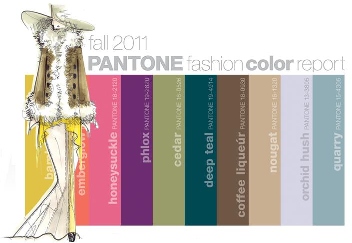
Fall 2011 Fashion Colours

Each season, Pantone surveys the designers of New York Fashion Week to identify the most directional colours.  Earlier this year they released the 10 most important colours of the season for women's fashion.
(Image: Pantone)
Taking cues from the great masters, sepia tones of old Hollywood, Chinese opera, cityscapes and countryside, designers are paying close attention to texture, contrast and color for fall 2011 – pairing menswear with feminine twists, warm prints with cool metals, incorporating both old and new influences, and creating an intriguing balance between colors. (Pantone)
“Designers take a painterly approach to Fall 2011 by artfully combining bright colors with staple neutrals, reminiscent of how an artist would construct a stunning work of art,” Leatrice Eiseman, executive director of the Pantone Color Institute. 

A lovely mix of neutrals with bright pops of colours. This is a colour palette that I liked right away.  I can easily visualize wearing these colours (except for maybe bamboo which I think I would have a hard time pulling off). As well, I can see these colours extending right into my home.  Orchid Hush and Quarry would look lovely on a living room wall, pared with charcoal grey. Nougat, Coffee Liqueur with Deep Teal would be a stunning combination as well.

What colour do you like?